.svg)
Liber
Liber is a SaaS platform designed for teams working with large media libraries.
Liber — SaaS Media Management Platform
Our role was to redesign the product experience from the ground up — simplifying complex workflows, improving clarity, and building a scalable interface that supports collaboration at scale.
Our primary focus was helping teams browse, organize, and manage content with confidence.
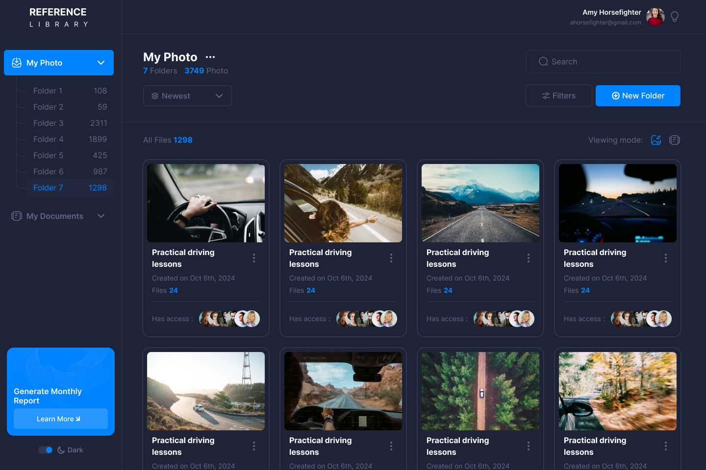
We introduced a card-based grid and dark theme to reduce cognitive load and improve scanability - allowing users to find assets faster, even in large libraries used daily by power users.
This screen embodies our commitment to product-driven UX, not just pretty visuals.

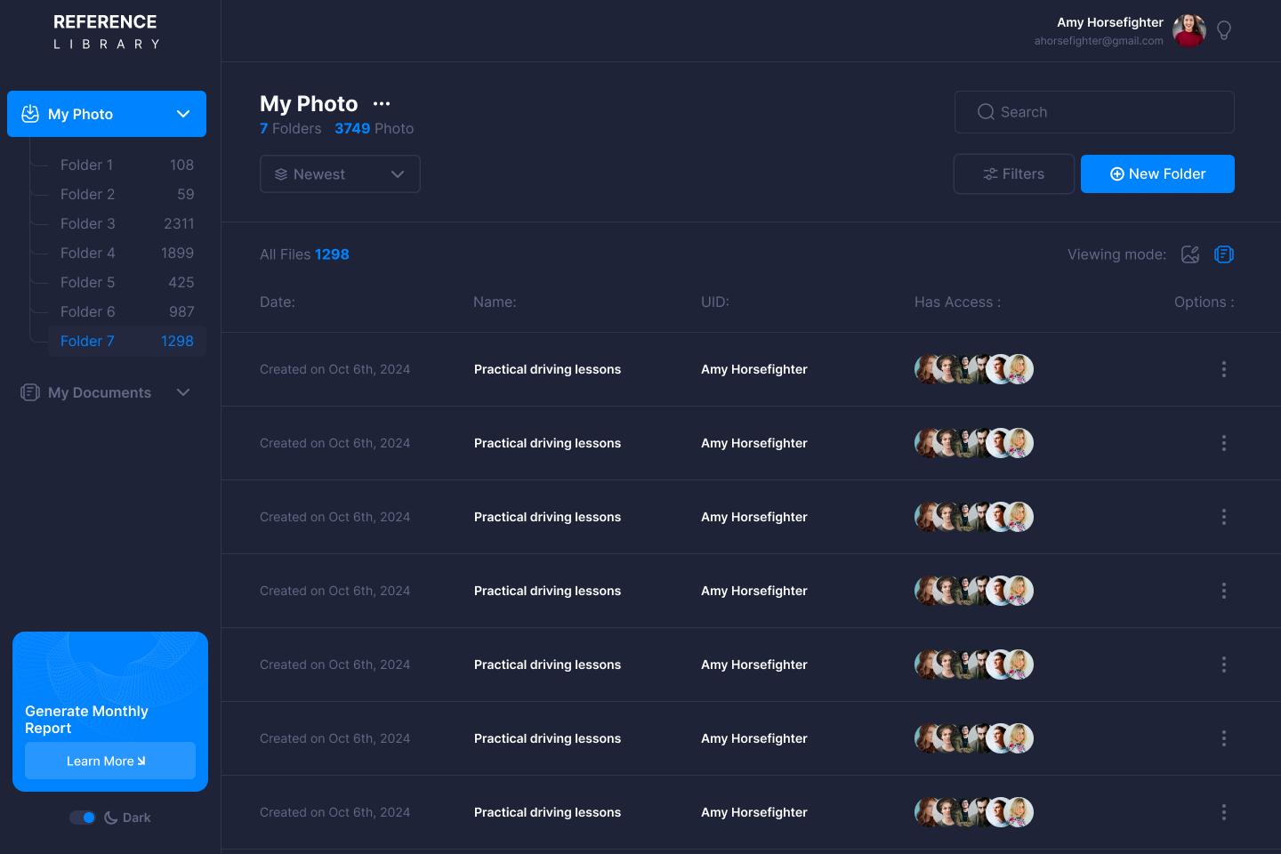
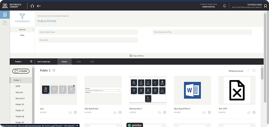
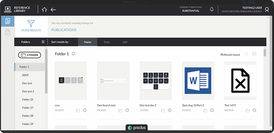
Search & Filtering — Find Anything in Seconds (UX Solution)
As content libraries grow, discoverability quickly becomes the real bottleneck.
We designed a powerful search and filtering system based on real usage patterns — not assumptions.
Users can instantly narrow results by date, tags, file type, or custom criteria, without breaking their flow.
The result: less friction, faster decisions, and noticeably smoother day-to-day work for content-heavy teams.
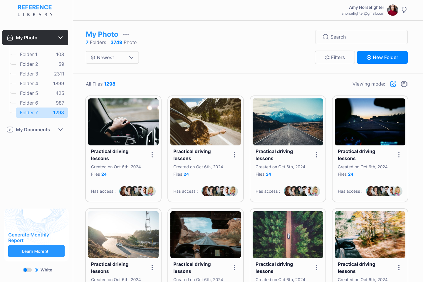
Light & Dark Modes — Built for Long Sessions
Not all users work in the same visual conditions — and long sessions demand flexibility.
We designed both light and dark modes to support different environments and working rhythms:
a dark interface for focused, extended use, and a light mode for daytime work and content review.
Both modes are built on a shared design system, ensuring visual consistency while giving users control over how they work.
The approach to assign one main designer to our project, that worked full-time on it, was very unique, but it allowed them to build a very detailed understanding of our - sometimes a bit complex - product.

Maria Kolomoyets
Legacy Interface (Before)
Before the redesign, the platform suffered from inconsistent layouts, unclear hierarchy, and visual noise that slowed users down.
Our UX audit uncovered multiple blockers that made collaboration inefficient — especially as teams and data volumes scaled.
These “before” screens highlight the core problems we addressed through product thinking, not surface-level design
The approach to assign one main designer to our project, that worked full-time on it, was very unique, but it allowed them to build a very detailed understanding of our - sometimes a bit complex - product.
Dennis Potomakin
Legacy Interface (Before: Business Impact)
Beyond usability issues, the legacy interface directly affected product adoption.
New users required additional onboarding, while experienced teams relied on workarounds instead of using the platform to its full potential. These insights helped us define clear redesign principles focused on scalability, clarity, and long-term growth.
Outcome & Impact
- The interface feels modern, intuitive, and scalable
- Content discovery is faster and more reliable
- Teams spend less time searching and more time executing
- Admins gain powerful control without added complexity
This project reflects our core philosophy:
"We don’t just design screens — we shape SaaS products people genuinely enjoy using"
Your Questions, Answered
Lorem ipsum dolor sit amet consectetur.
Book Your AI Demo
Contact: info@lscale.io
Contact details
Contact us if you have any questions
Let’s have a meeting to understand you and your business better and see if we can collaborate or help.
Schedule a call
Welcome to the Getmany Community
Lorem ipsum dolor sit amet consectetur. Tellus id pretium felis diam a. Nullam felis purus vehicula in. Urna molestie faucibus in in mattis leo magna dapibus.


Exclusive Access Required
2093 PHILADELFIA PIKE #1495, Claymont, DE19703, USA
